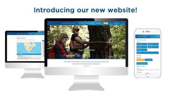
I am excited to officially announce that The Conservation Fund's website, conservationfund.org, has a fresh new look!
The big news? It is now easier than ever to explore our work! We've added an additional navigation layer and have completely redesigned our main menu and home page. In addition, our pages are now wider and easier to read (as you might have noticed by reading this blog post).
We are also excited to unveil our brand new interactive Where We Work map! It allows users to browse through our projects in all fifty states. With just a few clicks, users can find out about the work we do in the places that matter most. Here are a few of the improvements:
Navigation
Our main navigation menu is now more streamlined. The menu, located at the very top of each page, includes four major information hubs—'Our Work,' 'Where We Work,' 'Our Experts' and 'Donate.' Through our research, we learned that busy navigation menus make users confused. Therefore, we chose to refocus and optimize our main menu—providing a more responsive design and a more intuitive user experience.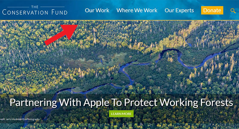
Our main navigation menu follows users throughout the website.
Our Work
The 'Our Work' section allows users to browse our projects based on simple and accessible words. These new access points make it faster and easier for both our longtime followers and future users to get acquainted with our work.
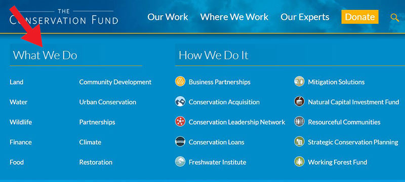
Hovering over the 'Our Work' button on our new navigation menu now brings up new ways to categorize the Fund's work.
The words featured under the 'What We Do' section lead to landing pages where those terms are further refined. For example, the 'Land' section links to 'Recreation Areas,' 'Federal Lands Conservation,' 'Forest Conservation, and 'Cultural Conservation.' 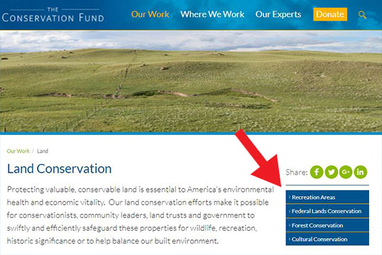
Users can now browse the Fund's work through additional sub-categories.
Where We Work Map
The 'Where We Work' section now features an interactive map that allows users to zoom in and out, and quickly find projects based on their location. When the map first loads up, users see clusters which can be continuously clicked until they reveal one of ten icons—these icons represent our ten programmatic areas. When a user clicks on an icon, additional information about the project appears below the map.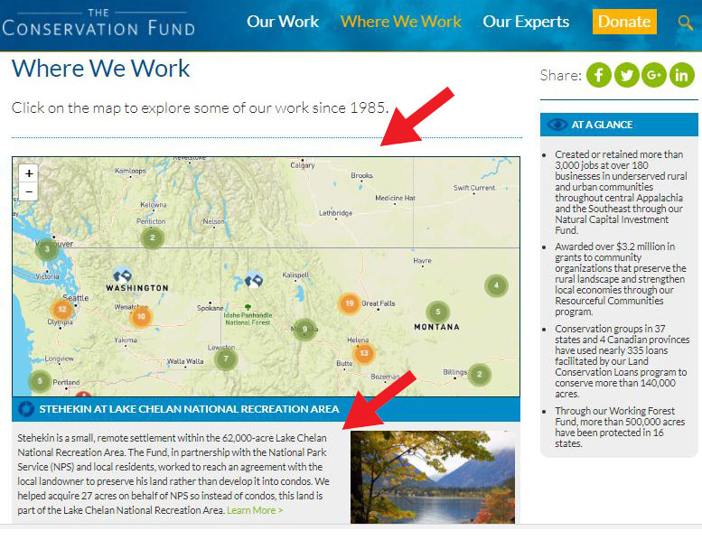
The interactive map also shows up on each of our state pages—displaying all the projects that are featured for that state. Have you had a chance to see our conservation accomplishments near you?
Home Page
Our 'Home Page' also received a significant makeover. It now features bigger images that link to our most recent work and accomplishments. As users scroll down the page, they access information about us and read our latest blogs, press releases and up-to-date resources. Make sure to check our Home Page often to stay on top of the latest news from the Fund!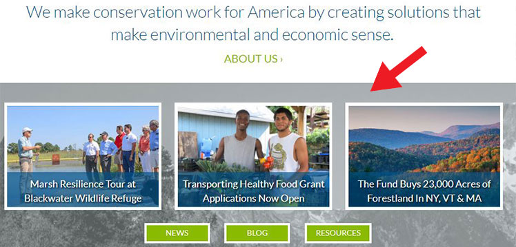
Donate Section
Donation pages usually suffer from problems like unresponsiveness, length, and clutter. In addition, it is generally recommended to carry over branding elements like colors, fonts, and logos to the Donate section to assure donors are in the right place. In our redesign, we streamlined our Donate menu: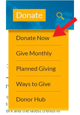
Hovering over the Donate button on the main navigation menu triggers a drop-down menu with options to 'Donate' and 'Give Monthly,' as well as 'Planned Giving' options, and 'Donor Hub,' which contains links to our 'Online Community.' The Donor Hub also links to our 'Cornerstone Society,' it allows users to send 'eCards' and even create a fundraiser page!
![]()
The 'Ways To Give' page makes it easy for our donors to choose the best way to support our work.
Improved Mobile Functionality
Good news mobile users! The changes outlined above also extend to our website’s mobile functionality. Our text is now easier to read, which has improved the readability of our content on mobile devices. Readability is one of the most important aspects of web design usability. We are excited to offer an even more pleasurable reading experience for our mobile users, who represented about 22% of our overall traffic in 2016.
The website changes reflect our ongoing efforts to streamline the Fund's digital content. The process, which was driven by collaborations between various departments within the Fund, was informed by best online practices and feedback we've received from our staff and followers.
I’d like to thank everyone who was involved in the redesign process. I welcome you to explore our work and see how The Conservation Fund redefines conservation every day through our new and improved website.


